

Legacy and Transition
I started working with Rencore's product team as the product designer when the company was transitioning to a new cloud paradigm and experimenting and testing new product ideas. Rencore Governance was born out of this research and experimentation.
I had produced the company's branding materials while developing its visual identity. At the time, these materials were beginning to hint at an undefined new cloud perspective. Legacy products had recently been brought under the company's Visual ID umbrella and had been re-branded for months. I had created new logos for each legacy product based on the company's brand colours and typography. As the company worked to pivot its offering to meet new challenges in the IT cloud, it faced a critical decision: should the next major product launch carry an entirely new brand identity, or should it build on the company's established visual foundations, in line with the recently rebranded legacy products? While creating a new brand identity was still on the table, most stakeholders favoured leveraging the company's existing visual equity.


As part of an initial strategy, all of the company's products were brought under a common brand ID, largely based on the Rencore corporate visual identity, which was already widely recognised in the IT industry.
Strategic Brand Evolution
It soon became clear that the existing products were losing market traction and that all resources and commitment needed to be focused on the new cloud solution that the company was now concentrating on building. Even as the first technical feasibility PoC was being developed, the marketing department was focused on how to name and brand the new product.

I was one of the advocates of creating a product brand that drew heavily on Rencore's visual ID. The company was well known in the German and European IT start-up community as a producer of quality software. This approach would allow for faster product recognition while leveraging the extensive body of branded technical publications that the company had produced and promoted over the years.

Rencore Governance logo variants prepared for different use cases, including product video signatures
Implementing Visual Continuity
Ultimately, this was the branding strategy followed for the launch of its new Cloud Governance SaaS B2B product, to be released as Rencore Governance. While other legacy products had also been renamed and rebranded under the Rencore visual identity and would remain available in the company's product portfolio, the new SaaS Cloud Governance solution would be the full focus going forward.


The layouts of the company's previous branded publications worked seamlessly and complementarily with the new product materials, as both were based on the same core visual elements, colours, typography and key layout elements such as the Rencore slant and illustration style
This strategy enabled a rapid reorientation in terms of visual communication. Key visual ID building blocks remained in place, such as brand colours, typography and the now highly recognisable slant and isometric illustrations, which were widely used in flyers, brochures and especially online, on the company's website and blog. Even the booth layouts could be easily adapted. We shifted from a company-focused booth to a product-focused booth, maintaining the company's visual style recognised by the IT community. We enhanced our key messaging points by introducing the value of cloud collaboration governance to a business audience that was already struggling with the challenges of cloud collaboration. Rencore Governance offered all the solutions they needed in a single product.

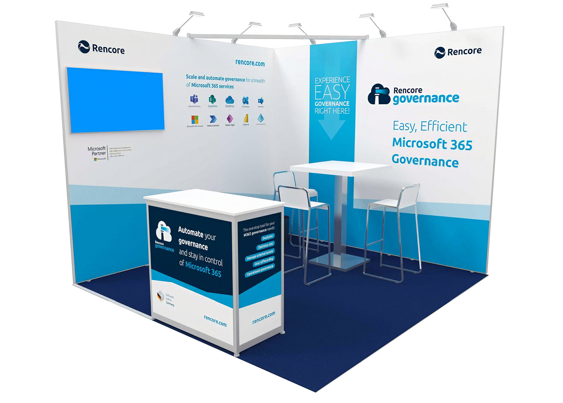
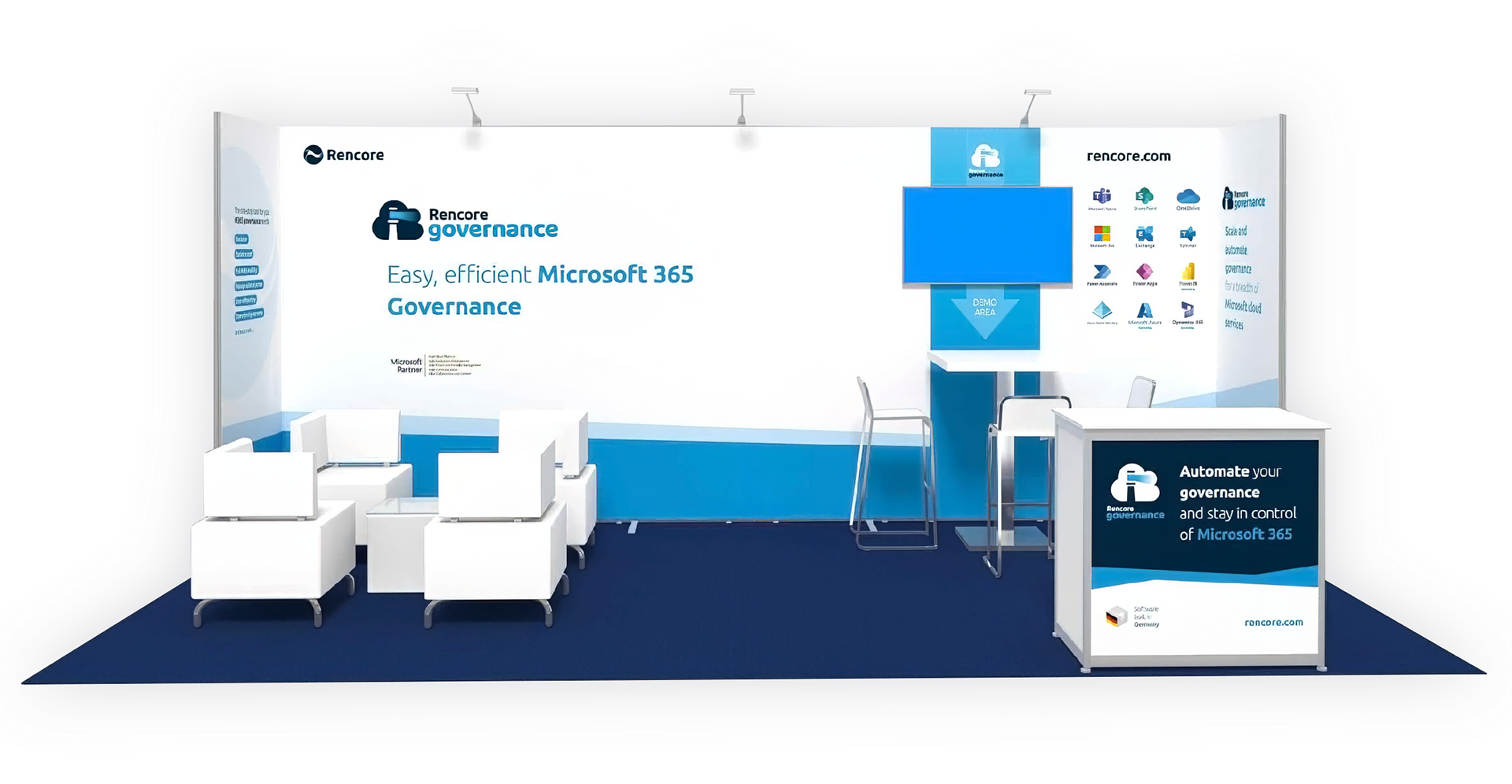
At events, on a booth communication level, by replicating the Rencore slant with a lighter colour scheme, I was able to maintain Rencore's key visual ID's elements while focusing the communication on the new product logo and tagline, achieving a more impactful message communication
Balancing Inheritance with Innovation
Building the new product's visual identity on Rencore's established brand foundations proved to be a strategic advantage. The company was able to transfer its market recognition to the new cloud solution while efficiently leveraging existing visual assets and marketing materials. Although this approach meant the new product wasn't launching with an entirely fresh visual identity, the benefits of brand equity conservation proved more valuable. The company had spent years building trust and recognition within the European IT startup community – an asset too valuable to leave behind

The new product logo allowed for a smooth image transition while ramping up governance messaging
The transition demanded careful balance. While the new product's branding maintained core visual elements from the company's identity, it also introduced subtle yet meaningful changes. The product logo took center stage, shifting the company logo to a supporting role, and the messaging evolved to reflect the new cloud-first direction. This approach allowed Rencore to signal both continuity and evolution: reassuring existing customers with familiar visual elements while clearly communicating its pivot to modern cloud solutions.


