

Dreaming of Writing with Clay
The opportunity to create ClayScript came about during a four-week Type Design Workshop, but the idea had actually been rattling around in my head for some years! As a huge fan of clay animation and graphics, I had always been dreaming of creating a typeface that could truly represent clay text – one that could be digitally edited as text and animated while keeping the unique qualities of physical clay.
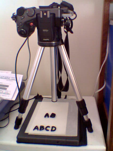
This typeface turned out to be a really fun and exciting project that combined elements of many different disciplines. I hand-modelled each character in clay, photographed them against high-contrast backgrounds using a light table, vectorised the shapes in Adobe Illustrator, and meticulously refined each glyph in FontLab to maintain the clay aesthetic while ensuring technical functionality.


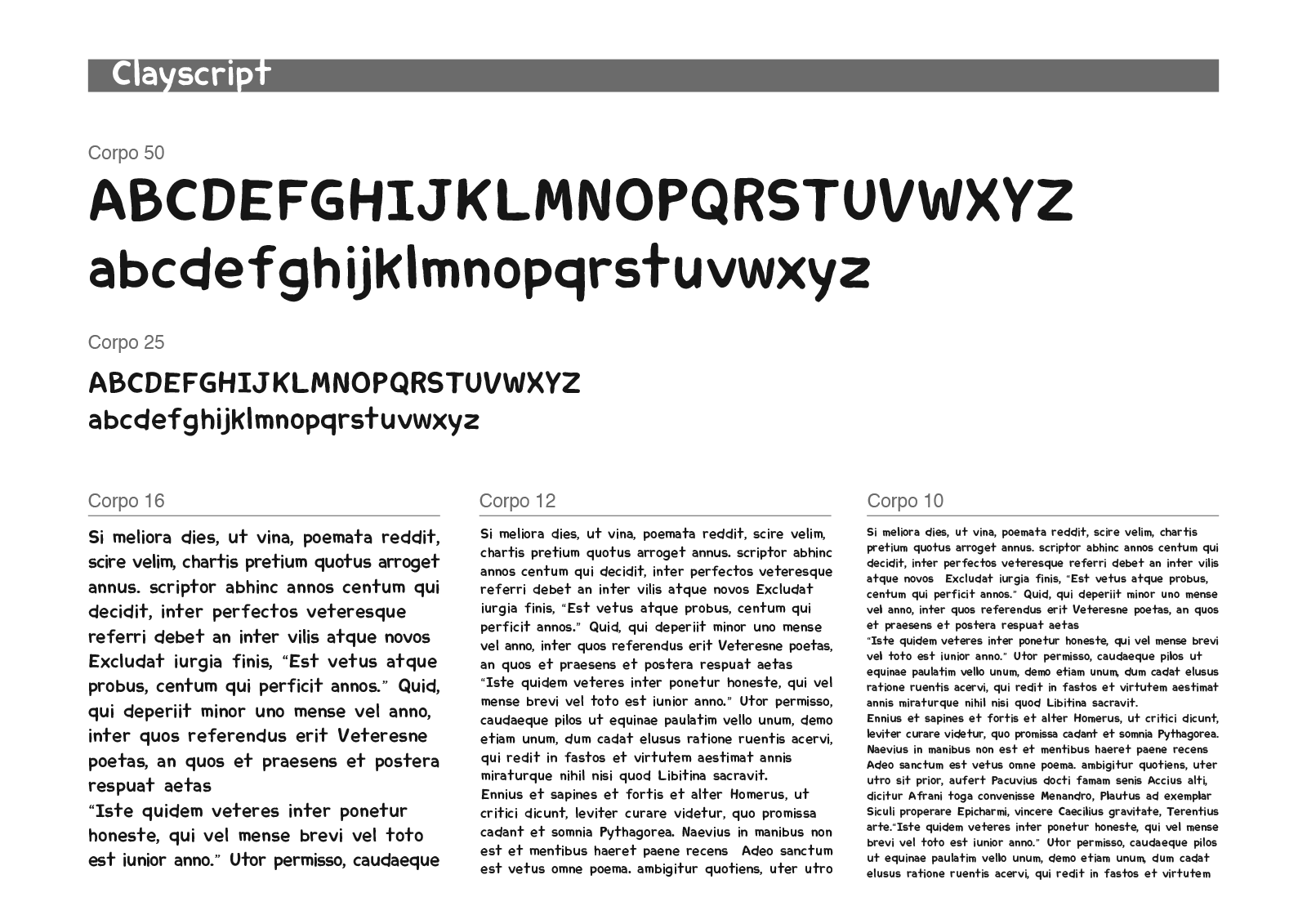
The result is a playful, volume-conscious typeface that convincingly mimics real clay letters when common volumetric and texture effects are applied using digital design tools, while remaining fully editable as digital text. While researching existing options, I discovered many "clay-look-alike" typefaces, but none captured the handcrafted physical dimensionality and tactile quality I was trying to achieve through careful attention to volume and form.

Interestingly, the finished typeface retains a reasonable level of legibility even in small text blocks, despite the fact that the final glyph shapes were not hinted for small font size screen reading — an unexpected benefit that extends beyond the original project objectives and adds practical versatility to what began as a primarily display lettering endeavor.